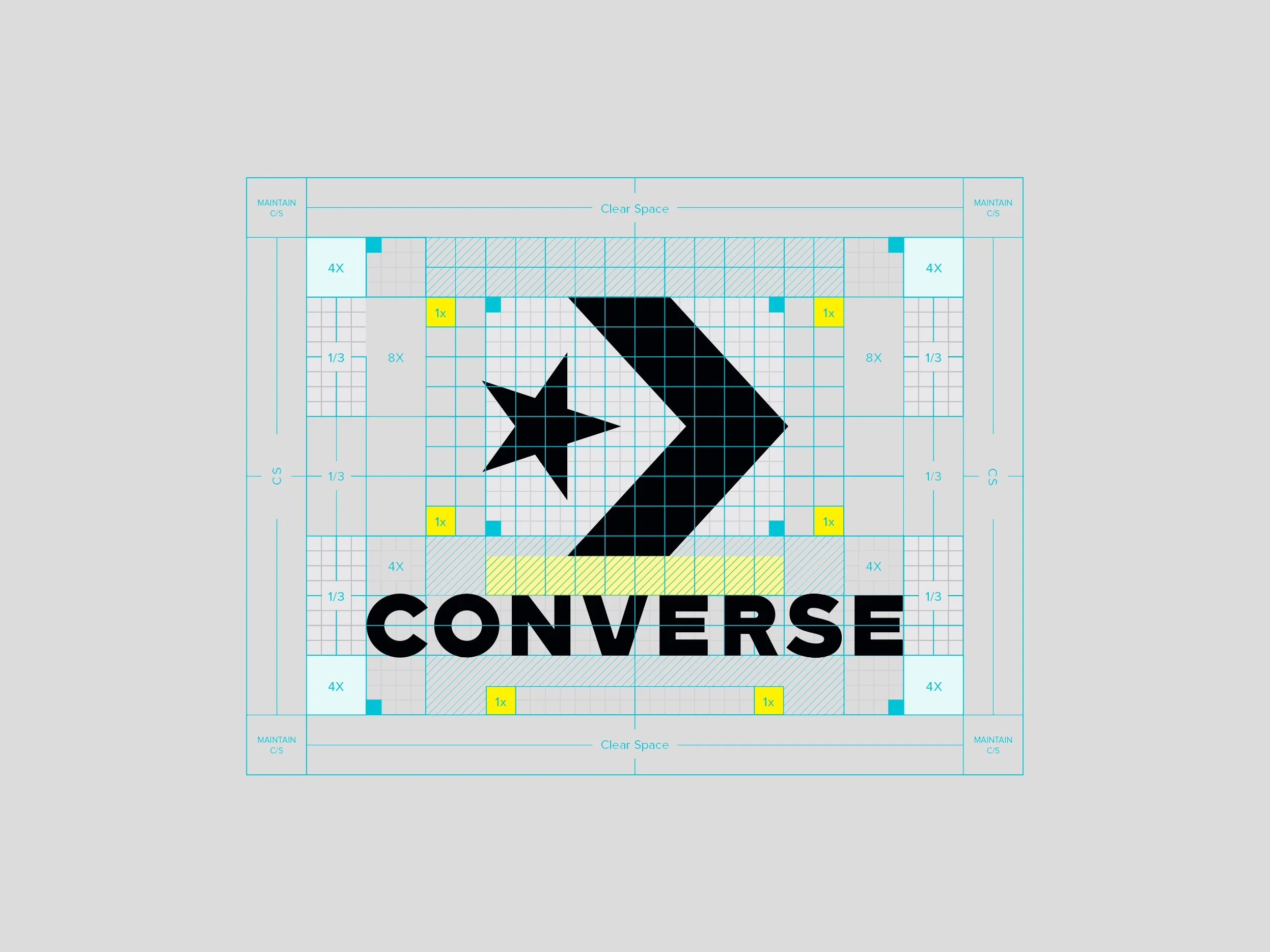
Converse Rebrand
As Converse transitioned into a youth-focused, fashion-forward brand, the Global Brand Design Team was tasked with executing a complete rebrand. Collaborating closely with product design and marketing leadership, the rebrand was globally launched in late 2016. The rebrand encompassed a refined Star Chevron logo and introduced a new Converse wordmark. Simultaneously, a comprehensive global brand guideline and identity were unveiled, covering typography, logo usage, and color.
To capture Converse's progressive essence, the combination of the star and chevron was carefully chosen, symbolizing a spirit of forward motion. The logo serves as a visual representation of the brand's core values, embodying movement, confidence, and simplicity. The iconic design harmoniously combines these concepts within two timeless shapes.
-
Logo Design
Logotype Design
Lockup Designs
Typography
Packaging Design
Tone of Voice
Brand Guidelines -
VP, Global Brand Creative: Adam Cohn
Brand Guidelines: Wedge & Leaver
New Logo
Old Logo


